Traditional holiday visuals almost always rely on the iconic red-and-green palette, but modern shoppers are increasingly drawn to fresh, elevated styles. That’s why Christmas design without red or green has become a leading trend for template sellers. By removing the two colors most associated with Christmas, you unlock new creative possibilities. Your work becomes more modern, more editorial, and more adaptable to different aesthetic preferences. Designing Christmas templates without red or green encourages you to explore new palettes, textures, shapes, and typography choices that make your products stand out in a crowded seasonal market.
Why Christmas Design Without Red or Green Works So Well
The reason Christmas design without red or green has surged is simple: not everyone wants bold, traditional visuals. Many buyers prefer a minimalist holiday aesthetic that feels soft, neutral, or high-end. Others want designs that match their home decor or winter event themes, which often don’t include bright red or pine green. By offering options that feel modern and subtle, you serve a broader audience — including shoppers who value simplicity, elegance, and visual calm. Removing traditional colors forces you to create atmosphere through layout and emotion rather than color stereotypes, resulting in more thoughtful and refined templates.
How to Choose a Palette for Christmas Design
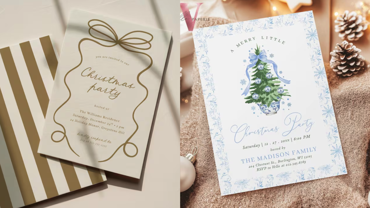
Color becomes even more important when creating Christmas design without red or green. Neutrals such as beige, ivory, charcoal, taupe, warm white, and deep brown create a soft holiday mood that feels natural and effortless. These tones mimic real winter textures — paper, wood, wool, and candlelight — making them perfect for cozy, stylish templates. Metallics also elevate your palette. Gold, silver, rose gold, and copper add warmth and shine without relying on traditional holiday colors. For cooler, more wintery looks, icy blue, slate gray, and muted lavender create a frosted, peaceful atmosphere that feels seasonal and modern.
Typography That Supports Christmas Design Without Red or Green
Typography becomes a core design tool when you’re creating Christmas design without red or green because the emotional tone must come through structure, not color. Clean serif fonts bring a timeless elegance ideal for menus, invitations, or greeting cards. Modern sans-serifs create an editorial aesthetic that aligns well with minimal Christmas styles. Rounded fonts add softness and warmth. The key is to use hierarchy — mixing weights, sizes, and spacing — to convey festivity without relying on red or green. When typography is used intentionally, even the simplest layout can feel beautifully seasonal.
Textures That Elevate Color-Free Christmas Designs
Texture gives depth and personality to Christmas design without red or green. Subtle textures like matte paper, linen fabric, soft grain, frost overlays, or delicate glitter help communicate winter atmosphere even in neutral palettes. A soft beige card with a gentle paper texture can feel more festive than a bright traditional design because the texture hints at warmth and craftsmanship. These textures make the template feel premium, giving buyers something fresh that still feels unmistakably tied to the holiday season.

Shape Language in Christmas Designs
When color isn’t the focal point, shapes become your storytelling tools. In Christmas designs minimalist stars, thin-line ornaments, abstract snowflakes, elegant bows, or simple winter silhouettes can signal the season without overwhelming the design. These gentle visual cues help the buyer understand the theme instantly, even when the palette is soft and understated. The beauty of using minimalist seasonal shapes is that they allow your design to remain neutral and modern while still feeling festive.
Why These Designs Appeals to Today’s Buyers
More and more shoppers search for templates that match neutral decor, minimalist aesthetics, or professional settings. Christmas design without traditional colors fits seamlessly into those preferences. These designs work for home gatherings, branding materials, office events, winter weddings, and cozy at-home celebrations. Because the palette is flexible rather than loud, buyers can use these templates in a variety of settings without worrying about color clashes. This versatility naturally increases sales potential and keeps your work relevant throughout the entire holiday season.
Conclusion: The Opportunity in Designing Christmas Without Red or Green
Choosing to create Christmas design without red or green allows you to break free from overused holiday visuals and explore a world of modern, elegant, and atmospheric design. By leaning into neutral palettes, subtle textures, strong typography, and minimalist shapes, you offer shoppers something rare: Christmas templates that feel fresh, timeless, and beautifully understated. As search trends continue shifting toward minimal and neutral aesthetics, Christmas design without red or green positions your shop ahead of the curve — giving you the opportunity to reach buyers who want holiday templates that feel festive without being predictable.