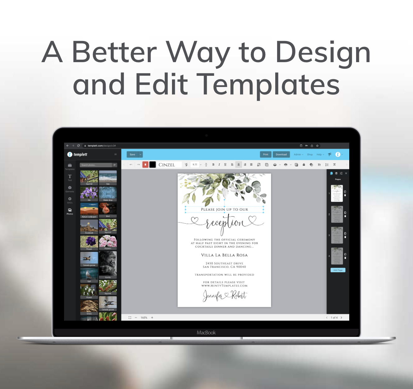
If you’re learning how to choose fonts for templates, you’re already thinking like a designer. Typography is one of the most important elements of any template because it influences how people experience your design before they even begin reading the content.
The right font choices can make a simple template feel elegant, modern, or playful. The wrong ones can make even a beautifully designed layout feel cluttered or unprofessional. The good news is that you don’t need an extensive typography background to make better decisions. By understanding a few key principles, you can create templates that are polished, easy to read, and ready to sell.
Start With the Style You Want to Communicate
Before choosing a single font, think about the feeling your template should create.
Every life event has its own personality. A wedding invitation often calls for elegance, while a birthday party invitation might be bold and energetic. A baby shower template may feel soft and welcoming, whereas a graduation announcement could benefit from a clean, modern style.
Your typography should reinforce that mood rather than compete with it.
Instead of choosing fonts because they’re trendy, ask yourself whether they match the occasion. When your fonts support the overall style of the design, everything feels more cohesive and intentional.
Prioritize Readability Over Decoration
One of the most common mistakes new template sellers make is choosing fonts that look beautiful but are difficult to read.
Decorative fonts certainly have their place, especially in headings or names, but they shouldn’t carry the entire design. Buyers want templates that are attractive and easy to customize, and readability plays a huge role in creating that experience.
If people have to slow down to understand the text, the design becomes less effective.
As a general rule:
- Use decorative fonts for emphasis.
- Choose simple fonts for body text.
- Make sure text is easy to read at different sizes.
A professional template should feel effortless to read from beginning to end.

Limit the Number of Fonts
More fonts don’t create more personality—they usually create more confusion.
Many beginners try to combine several different typefaces because each one looks interesting on its own. Unfortunately, too many styles competing for attention often make a design feel inconsistent.
In most cases, two fonts are all you need.
A common combination is pairing a decorative or serif font for headings with a clean sans-serif font for supporting information. This creates contrast while maintaining consistency throughout the design.
Limiting your font choices also helps establish a recognizable style across your entire shop, making your products feel more cohesive as your catalog grows.
Create Contrast Between Headings and Supporting Text
Learning how to choose fonts for templates isn’t just about selecting attractive typefaces. It’s about creating a clear visual hierarchy that helps buyers quickly understand the information on the page.
Good typography makes it obvious what should be read first. Instead of relying on multiple font styles, use hierarchy to guide the reader by adjusting:
- Font size
- Font weight
- Color
- Spacing
A large heading paired with smaller supporting text naturally draws attention to the most important information, making your templates easier to read and more professional.ye through the design. This creates a cleaner layout and makes your templates feel professionally designed.
Pair Fonts That Complement Each Other
Not every beautiful font works well with another.
The goal of font pairing isn’t to find two dramatic styles. It’s to create balance.
For example, if your heading uses an elegant script font, pairing it with a simple sans-serif font creates contrast without overwhelming the design. Likewise, a classic serif heading often pairs beautifully with clean, modern body text.
When evaluating a font combination, ask yourself:
- Do these fonts feel like they belong together?
- Is there enough contrast without looking disconnected?
- Does one font support the other rather than compete with it?
If the answer is yes, you’re likely on the right track.
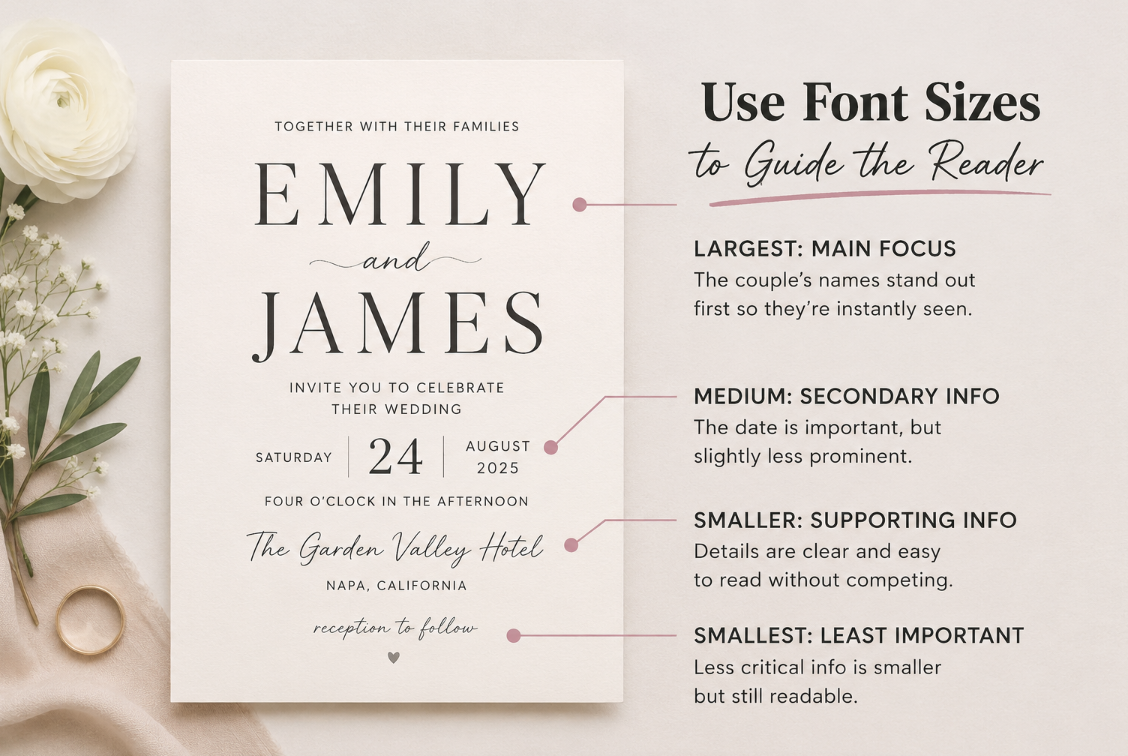
Use Font Sizes to Guide the Reader
Professional templates don’t rely on typography alone—they rely on typography working together with layout.
Think of font sizes as a visual roadmap.
The largest text should communicate the main message, followed by subheadings and then supporting information. This creates visual hierarchy, making the design easier to scan and understand.
When every line of text is similar in size, buyers have to work harder to find important information. Simply increasing the size of key elements and giving them enough surrounding space can dramatically improve the overall appearance of your template.
Stay Consistent Across Your Products
Knowing how to choose fonts for templates doesn’t just improve individual designs—it also helps you build a recognizable brand as your shop grows.
Using consistent typography across wedding invitations, baby shower games, birthday signs, bridal shower templates, and other life-event products creates a cohesive collection that buyers begin to recognize and trust.
Consistency doesn’t mean every template should look the same. Instead, your font choices should feel intentional and connected, giving your shop a polished, professional appearance.
Creating a small library of trusted font pairings makes it easier to customize new templates while maintaining a consistent style across your entire product range.
Avoid Common Typography Mistakes
Many typography issues come from trying to do too much.
Before publishing a template, look for these common mistakes:
- Using too many fonts
- Choosing decorative fonts for long paragraphs
- Making headings too similar in size to body text
- Using low-contrast text colors
- Crowding text with too little spacing
These problems are usually quick to fix, but correcting them can dramatically improve the overall look and readability of your design.
Final Thoughts
Learning how to choose fonts for templates isn’t about memorizing typography rules or finding the trendiest typefaces. It’s about making intentional design decisions that improve readability, strengthen visual hierarchy, and create a cohesive look.
The best templates don’t rely on flashy fonts to stand out. They use typography to guide the reader, support the overall design, and create a polished experience from the moment a buyer opens the template.
Start by choosing fonts that fit the occasion, limit yourself to one or two complementary typefaces, and prioritize clarity over decoration. As you apply these principles across more products, you’ll develop a recognizable design style and create templates that feel professional, unique, and ready to sell.