Creativity is what makes your templates stand out. But too much of it can backfire. For many sellers, the real danger lies in over-designing templates—making them so detailed or complex that buyers feel overwhelmed instead of excited.
When life event templates are supposed to make party planning easier, the last thing a customer wants is a design that feels impossible to edit. Let’s break down why over-designing templates is risky and how you can strike the perfect balance between beauty and usability.

The Problem: Beautiful but Broken
A template that looks stunning in a shop preview doesn’t always translate into a smooth buyer experience. Overly complicated layouts or tricky fonts can frustrate buyers who just want to change a name or date.
Sellers often learn the hard way that over-designing templates can lead to refund requests, poor reviews, and fewer repeat customers. It might even discourage potential buyers from completing a purchase if they notice that the design looks too advanced to edit easily.
At first glance, intricate designs may seem impressive. But in practice, they can create a barrier between your product and your customer’s success. If a buyer spends more time figuring out how to use the template than actually customizing it, the shopping experience turns into a headache.

Why Buyers Struggle with Complexity
Remember: most buyers aren’t graphic designers. They’re brides, parents, small business owners, or recent graduates—people planning emotional milestones under tight deadlines. If they feel like your product requires a design degree to use, they’ll regret their purchase and may never buy again.
This is why avoiding over-designing templates is critical. Buyers want templates that make their lives easier, not harder. The best designs help them feel confident and in control.
Here’s what buyers are really looking for:
- Clean layouts that adjust easily across different formats or sizes
- Fonts that are stylish but still readable
- Colors that can be swapped without breaking the design
- A quick, intuitive editing process with no hidden roadblocks
When your template delivers on these expectations, you’re not just selling a design—you’re selling peace of mind.
Do’s and Don’ts to Avoid Over-Designing
Finding the right balance takes practice. The key is to create templates that look professional but remain simple for customers to personalize. Here are some helpful do’s and don’ts to guide your process:
Do:
- Keep your layouts clear and intuitive
- Test your template from a buyer’s perspective before publishing
- Use decorative fonts only for titles or highlights
- Maintain consistent spacing and alignment for a polished look
Don’t:
- Add too many flourishes that clutter the design
- Rely on complex formatting buyers can’t easily adjust
- Use too many color variations that confuse the layout
- Assume “more details” means “more value”
Following these principles helps you prevent the risks of over-designing templates while still offering designs that feel unique and beautiful. The Etsy Seller Hand book also emphasizes how clarity and balance in your visuals can make your listings more appealing and drive more sales.

A Simple Metaphor
Think of your templates like a wedding cake. A cake with the right amount of decoration is elegant and inviting. But if you pile on too many layers, colors, and toppings, it collapses—or worse, no one wants to eat it.
The same goes for over-designing templates: they may look impressive but can quickly become unusable. A minimalist design might not get as many “oohs” and “aahs” at first glance, but it delivers what matters most—ease, flexibility, and satisfaction.
Remember, your buyers are looking for templates they can make their own. The more approachable your design feels, the more likely it is to sell—and to get glowing reviews.
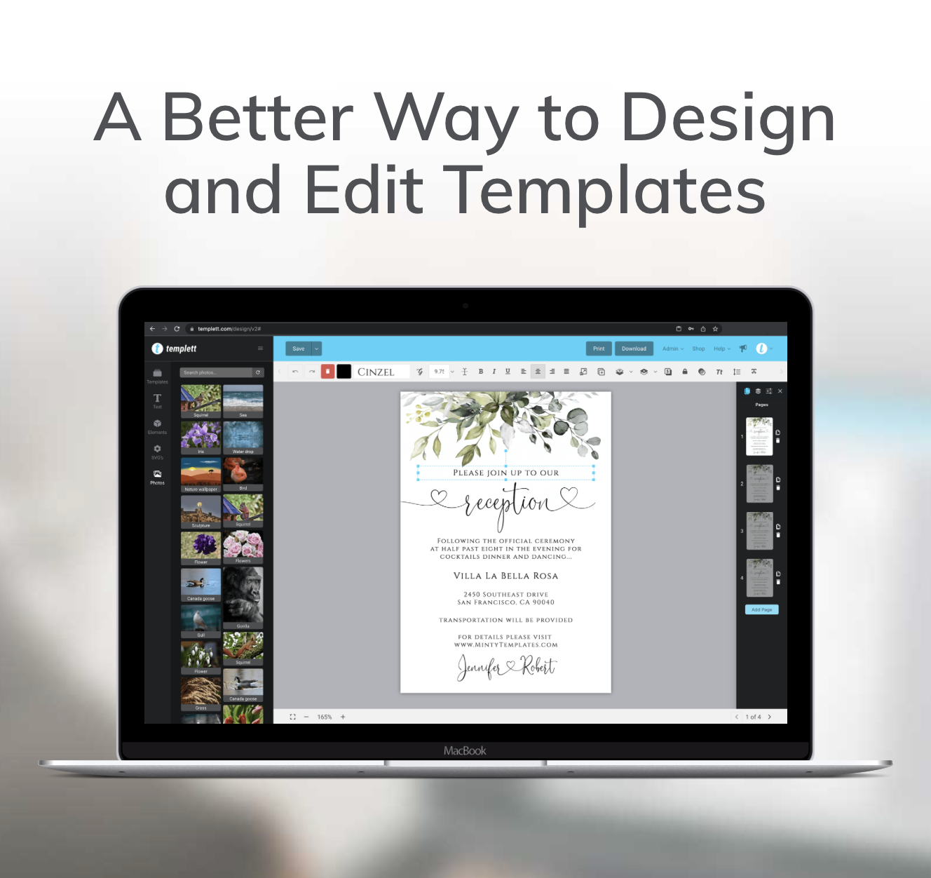
How Templett Helps Maintain Balance
One of the best things about using Templett is that it naturally supports the balance between creativity and usability. The platform’s editor is built for simplicity, so sellers can design boldly without overwhelming buyers.
Even if your template includes decorative elements or artistic fonts, Templett’s intuitive editing tools keep the experience smooth for customers. Buyers can easily change text, colors, or images without fear of “breaking” the design.
As a seller, this gives you freedom to focus on creativity—knowing that Templett ensures a seamless customization process for every customer. You can experiment with patterns, icons, or layered backgrounds while still maintaining a user-friendly editing experience.
Ultimately, Templett allows you to express your unique design style without falling into the trap of over-designing templates.
Key Takeaways
Balancing creativity and usability is what separates top-performing templates from the rest. While it’s tempting to make your designs as elaborate as possible, simplicity often sells better.
Here’s what to remember:
- Overly complex templates frustrate buyers and lead to negative reviews
- Avoid over-designing templates by focusing on clarity, usability, and customer experience
- Test every template as if you were the buyer—if it’s not easy for you, it won’t be easy for them
- Templett makes this balance achievable, allowing you to design freely while keeping your customers happy
In the end, simplicity doesn’t mean boring—it means smart design. The right balance ensures happier customers, stronger reviews, and more sales.
When your templates are easy to use and beautiful to look at, you’ve created the perfect combination: creativity that sells.