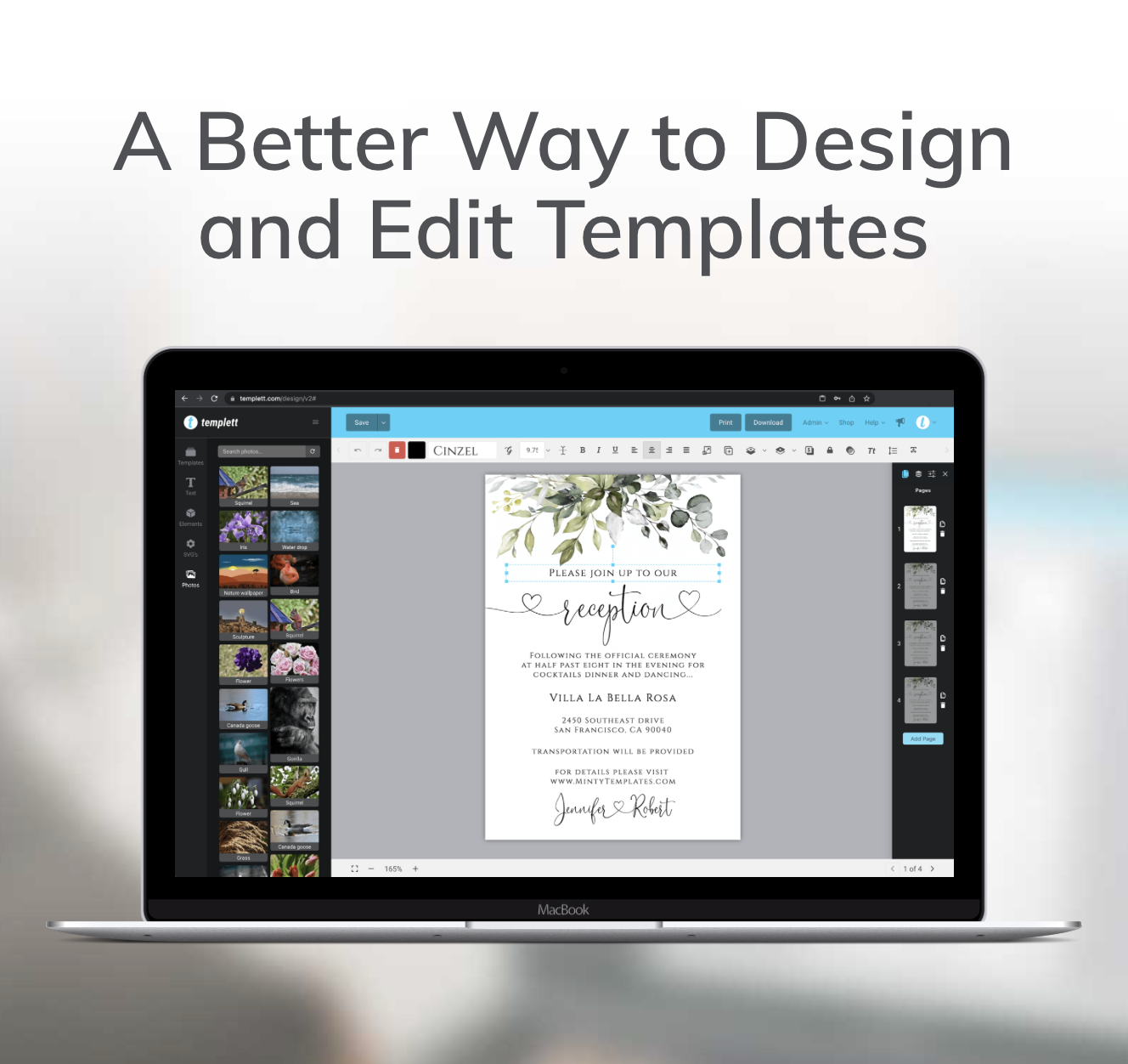
Every summer, buyers start searching for the same thing: invitations that instantly feel fun, fresh, and worth celebrating with. That makes pool party invitation templates a seasonal staple for template sellers—but also a competitive one.
The difference between a template that gets overlooked and one that earns the click usually isn’t a complicated layout or dozens of decorative graphics. It’s whether the design feels intentional. Buyers can tell within a few seconds if a template looks polished, current, and easy to customize. That’s what they’re really shopping for.
If you’re creating pool party invitations this season, focus less on adding more elements and more on making better design decisions. Those are the details that make a template feel professional and help it stand out in a crowded marketplace.
Start With One Strong Concept
A common mistake is trying to capture every part of summer in one invitation. Palm trees, flamingos, beach balls, sunglasses, hibiscus flowers, popsicles, waves, and tropical leaves all have their place—but not all at once.
The strongest invitations usually revolve around one clear idea.
Maybe it’s a colorful retro pool party with playful typography. Maybe it’s a modern adults-only poolside gathering with bold color blocking. Or maybe it’s a tropical birthday with oversized botanical illustrations.
Once you’ve chosen a direction, let every design decision support it. Your fonts, illustrations, colors, and layout should all feel like they belong together. That’s what creates visual cohesion, and it’s one of the quickest ways to make a design look professionally designed.
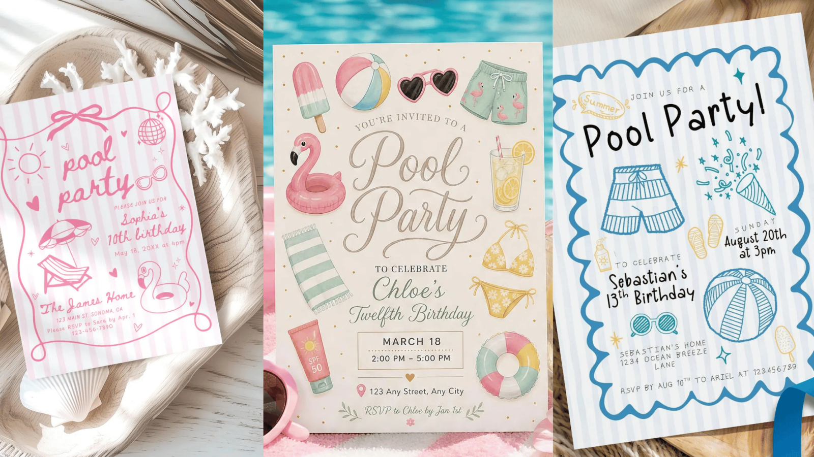
Choose Colors That Feel Fresh, Not Expected
For years, summer invitations followed the same formula: turquoise, coral, and sunshine yellow. They still work—but they’re no longer the only way to communicate summer.
Current design trends lean toward bolder, less predictable color combinations. They feel playful, energetic, and just different enough to make someone stop scrolling.
Try experimenting with combinations like:
- Green apple + cobalt blue + cream for a crisp, modern look.
- Tangerine + aqua + hot pink for a playful retro aesthetic.
- Pistachio green + butter yellow + lavender for a softer but still vibrant palette.
- Turquoise + chili red + white for high contrast with a poolside feel.
- Royal blue + lime green + orange for bold, energetic summer designs.
- Watermelon pink + citrus orange + teal for invitations inspired by tropical vacations and fruit-forward color trends.
Instead of using every bright color available, let one become the hero. Supporting colors should create balance rather than compete for attention. A restrained palette almost always feels more premium than one that tries to do everything at once.

Design for the Thumbnail First
Before buyers read your title, your description, or even your product photos, they see one tiny thumbnail.
That’s where your invitation has to do its hardest work.
When you zoom out, ask yourself one question:
Would I click this over the twenty invitations beside it?
If the answer isn’t immediately yes, look at the overall composition instead of adding more decoration.
Often the solution is surprisingly simple. Increase the size of the headline. Remove one illustration. Add more white space. Simplify the background.
Those small changes create breathing room, and breathing room is often what makes a design feel expensive.
Let Typography Do More of the Work
Many designers rely on graphics to make a summer invitation feel exciting, but typography can create just as much personality.
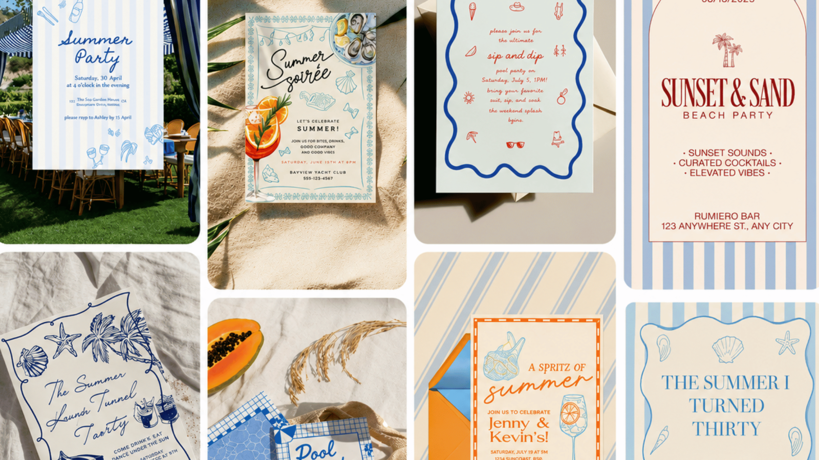
A bold condensed headline instantly feels modern. A playful handwritten font adds energy without requiring extra illustrations. Pairing expressive display fonts with a clean body font creates contrast while keeping the invitation easy to read.
The goal isn’t to use more fonts—it’s to use them with purpose.
Every text style should help guide the buyer’s eye naturally from the event title to the important details.
Readability Is Part of the Design
Beautiful pool party invitation templates designs still need to function.
If someone has to search for the date because it’s sitting on top of a busy water texture, the design isn’t finished yet.
A great pool party invitation templates makes information effortless to find. Clear hierarchy, generous spacing, and consistent alignment help buyers immediately recognize that the template is polished and easy to customize.
Ironically, the more decorative your invitation becomes, the more disciplined you need to be with typography and spacing.
Those two elements are what keep the design feeling balanced instead of busy.
Think Like a Seller, Not Just a Designer
The best-selling templates usually have one thing in common: they’re flexible.
Instead of designing one pool party invitation template for a very specific event, create layouts that buyers can easily adapt.
The same invitation can work for:
- Summer birthdays
- Graduation parties
- Family pool parties
- Neighborhood gatherings
- End-of-school celebrations
- BBQs with a pool
That flexibility makes your product more valuable and gives buyers more reasons to choose it over a design that only fits one occasion.
Build Collections Instead of Individual Listings
Once you’ve finished an invitation, don’t move on to a completely different design.
Instead, ask yourself what matching products someone planning a pool party might also need.
A coordinated collection could include:
- Welcome sign
- Thank you card
- Drink menu
- Favor tag
- Food labels
- Cupcake toppers
- Party banner
Creating matching pieces takes far less time than designing from scratch because you’ve already established the typography, color palette, and illustration style.
It also gives your shop a more cohesive look, making buyers more likely to purchase multiple templates instead of just one.
Don’t Reinvent Every Summer
One of the smartest ways to grow your shop is by treating every successful template as the starting point for the next one.
A layout that worked well for a birthday invitation can become a pool party invitation with a refreshed color palette, new illustrations, and updated wording. The structure doesn’t need to change—only the personality.
This repeatable approach helps you create new seasonal products much faster while maintaining a recognizable design style across your shop.
Over time, that consistency becomes part of your brand. Buyers begin to recognize your work before they even open the listing.
Final Thoughts
Creating successful pool party invitation templates isn’t about following every summer trend or filling your design with seasonal graphics. It’s about understanding what buyers notice first: clean layouts, thoughtful color choices, clear typography, and a style that feels current without trying too hard.
Every invitation you create is an opportunity to build trust with a buyer. When your templates feel polished, cohesive, and easy to personalize, they don’t just attract clicks—they inspire confidence.
And that’s what turns a casual browser into a customer.
The best part is that this process is repeatable. Once you’ve built one strong summer template, you can use the same design principles to create invitations for birthdays, bridal showers, family reunions, baby showers, and every celebration that follows. Instead of starting over each time, you’re building a collection that’s ready to grow alongside your shop.