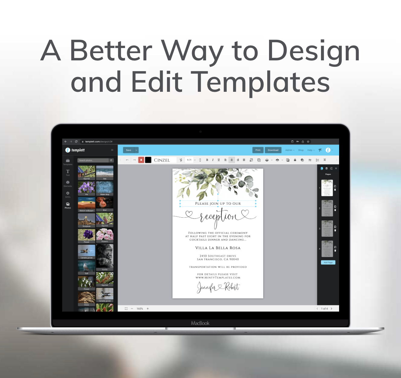
Creating beautiful, professional designs doesn’t require years of graphic-design training — especially when you’re using Templett. The platform gives you creative control, intuitive tools, and flexibility to design for any occasion. But even with great tools, understanding a few fundamentals can make your work truly stand out. In this post, we’ll share practical templates design tips for choosing fonts that match your style, using color psychology effectively, and preparing your files for flawless printing. Whether you’re designing invitations, business cards, or signage, these steps will help you bring your creative vision to life with confidence.

Choosing Fonts That Fit Your Style
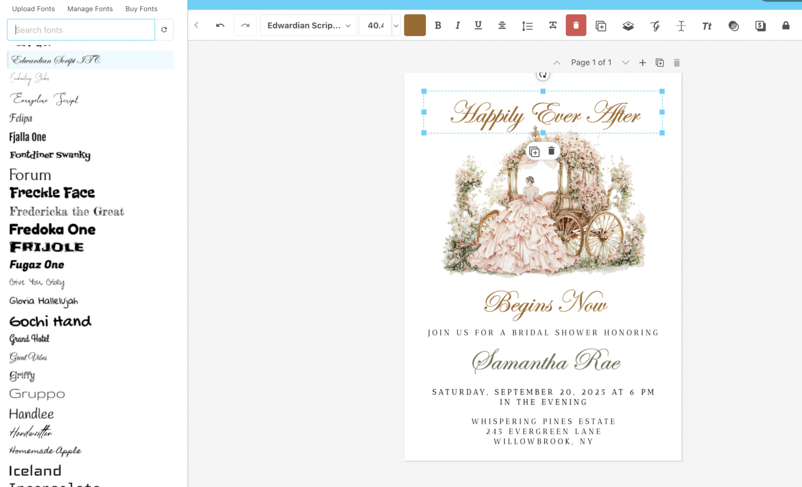
Fonts have personality. They set the tone of your entire design and communicate emotion before a single word is read. In Templett, you have hundreds of fonts to explore — and each one tells a different story.
When choosing a font, start by thinking about your event or brand’s “vibe.” Do you want something soft and romantic, sleek and modern, or bold and playful? Here are some dependable options you can try right in Templett:
- Romantic or elegant: Script fonts like Allura or Great Vibes create movement and sophistication. They’re ideal for wedding invitations or formal events.
- Modern and minimal: Sans-serifs such as Montserrat or Raleway convey simplicity and polish. These fonts work well for business templates or modern celebrations.
- Rustic or organic: Fonts with a natural flow, like Amatic SC or Chonburi, bring warmth and handcrafted character. They’re perfect for boho, farmhouse, or outdoor-inspired themes.
💡 Templett Tip: Use the built-in text editing panel to preview different fonts side by side. Seeing them together helps you instantly identify which one matches your design’s personality.
When pairing fonts, balance is key. Combine a decorative script with a clean sans-serif, or a bold headline font with a subtle body text. Templett makes font pairing simple — just duplicate a text box, switch fonts, and compare until you find the right harmony. These small yet impactful templates design tips can elevate even the simplest layouts into something eye-catching.
Using Color Psychology in Design
Color has emotional power. It can make a design feel cozy, modern, luxurious, or calm — all without saying a word. Inside Templett, adjusting your color palette is effortless, but understanding the “why” behind color choices can make your designs far more impactful.
Here’s what different color families typically communicate:
- Blush & neutrals: Timeless, romantic, and elegant. Perfect for weddings and soft event themes.
- Terracotta & rust tones: Warm, grounded, and bohemian. A favorite for rustic or desert-inspired designs.
- Greens & blues: Natural, calming, and balanced. Great for botanical, coastal, or outdoor events.
- Black & white: Minimal, bold, and sophisticated. Ideal for modern or high-end branding.
💡 Templett Tip: Use Templett’s eyedropper tool to maintain consistency across your design elements. When you select a color you love, the eyedropper tool allows you to instantly apply that exact shade to text, backgrounds, or decorative graphics. This small step keeps your designs cohesive and professional.
If you’re creating a collection of matching templates — like invitations, RSVP cards, and menus — consistency in color is crucial. A unified palette ties everything together visually and strengthens your brand or event theme.
Also, remember contrast. Light text on a light background (or dark on dark) can be difficult to read. Use contrast intentionally: dark typography on a pale background looks clean and modern, while light text on a rich color can feel dramatic and elegant. Templett’s live preview makes it easy to test these variations before finalizing your design.
Preparing Files for Printing
Once you’ve finalized your fonts and colors, the last step is ensuring your design prints perfectly. File preparation may not feel glamorous, but it’s what separates an amateur project from a professional one.
Here’s how to get print-ready results in Templett:
- Double-check spacing and margins. Nothing should sit too close to the edge of the page. Use Templett’s alignment guides to center your design and maintain balanced borders.
- Export the right file type. For printing, always export your design as a PDF. Templett automatically optimizes PDFs for high-quality print resolution.
- Do a test print. If you’re printing at home, use premium cardstock and print one copy first. Check alignment, color, and readability before running the full batch.
- Confirm printer preferences. Some print shops prefer CMYK color profiles, while others accept RGB. Templett’s high-resolution exports work beautifully for both, but double-checking ensures color accuracy.
- Choose the correct download for your use. Use JPEG if your design will be shared digitally (like for online invitations or social media graphics). Stick with PDF for professional printing.
💡 Templett Tip: If your design has a background color or pattern that extends to the edges, make sure to include a small “bleed” area so the final trim looks clean. Templett makes this easy — just slightly extend your background beyond the document border.
Bringing It All Together
When you combine thoughtful font pairing, intentional color use, and careful file prep, your Templett designs transform from simple to stunning. The beauty of Templett is that it gives you freedom — the tools are easy to use, but they’re also powerful enough to let your creativity shine.
Great design is about balance. It’s about knowing when to keep things simple and when to add flair. By applying these templates design tips, you’ll create templates that not only look beautiful on screen but also print perfectly every time.
Whether you’re crafting for clients, selling templates, or designing something personal, remember: your creativity is your strongest asset — Templett simply gives it a home.