Halloween design doesn’t have to mean scary skeletons, dripping fonts, and orange-and-black everything. Some shoppers want spooky. Others want cute ghosts for a first birthday, pink pumpkins for a girls’ night, vintage graphics for a retro party, or something sophisticated enough for an elegant Halloween dinner. That variety creates an opportunity for template sellers. These Halloween template design ideas will help you explore different aesthetics while keeping your designs polished, readable, and sell-ready. And you don’t need advanced graphic design skills to try them. Starting with a ready-made template and making a few intentional changes to the colors, typography, imagery, and layout can take your design in a completely different direction.
The goal isn’t to make Halloween less Halloween. It’s to give shoppers more ways to celebrate it.

Why Halloween Templates Need More Variety
Scroll through Halloween invitations and you’ll quickly notice how differently people celebrate the same holiday.
A parent planning a toddler’s birthday probably isn’t looking for the same aesthetic as someone hosting a Halloween cocktail party. A school event may call for friendly illustrations, while an adult dinner party could work better with something dark and sophisticated.
Instead of creating five versions of essentially the same Halloween invitation, think about how one event could appeal to several different shoppers.
A Halloween party invitation could become a pastel kids’ party, a sophisticated cocktail night, a retro ’70s bash, a minimalist dinner invitation, or a cute “Boo!” birthday.
You’re not reinventing the product every time. You’re making thoughtful design decisions that create more variety.
Here are six Halloween template design ideas you can use to get started.
1. Try a Cute Halloween Aesthetic
Halloween can be adorable.
Friendly ghosts, smiling pumpkins, candy, bows, black cats, stars, and playful illustrations can make a template feel festive without making it scary.
This direction works especially well for children’s birthdays, classroom parties, pumpkin carving events, trick-or-treat gatherings, and family celebrations.
You can also move beyond the traditional orange-and-black palette. Try combinations like blush and orange, lavender and peach, or pastel pink with warm yellow and brown.
The key is visual cohesion.
Choose a limited palette and repeat those colors throughout the design instead of giving every illustration a different color.
Keep readability in mind, too. A decorative font can bring personality to the headline, while a cleaner typeface makes dates, times, locations, and RSVP details easy to scan.

2. Make Halloween Feel Elegant
Halloween can be surprisingly sophisticated.
Imagine a deep burgundy background, small gold stars, elegant serif typography, and one understated pumpkin illustration.
It still feels seasonal without relying on obvious spooky imagery.
This style can work beautifully for adult birthday parties, Halloween dinners, cocktail parties, bridal events, and fall gatherings.
Experiment with plum, chocolate brown, muted orange, charcoal, cream, and metallic-inspired accents.
And resist the urge to fill every empty space.
Whitespace can make a design feel more intentional and polished. A few carefully placed decorative elements often create stronger visual hierarchy than dozens of Halloween graphics competing for attention.
Among all the Halloween template design ideas you can experiment with, this is a great one for creating a more elevated product collection.

3. Give Halloween a Vintage Twist
Vintage Halloween has plenty of personality without needing to be frightening.
Think retro typography, faded oranges, mustard yellow, cream, muted black, checkerboard patterns, old-fashioned pumpkins, and nostalgic illustrations.
Typography can do a lot of the work here.
Start with a strong retro-inspired headline and keep the supporting information much simpler. That contrast creates hierarchy and helps shoppers immediately understand what the event is.
Once you establish the aesthetic, you can carry it across an entire coordinated collection.
An invitation could lead to matching welcome signs, favor tags, menus, thank-you cards, party games, or other event templates.
One strong visual direction suddenly becomes the foundation for multiple products.

4. Keep It Minimal
Halloween designs don’t need twenty pumpkins to feel seasonal.
Sometimes one is enough.
A minimalist Halloween invitation might use a neutral background, one small illustration, bold typography, and plenty of breathing room.
The challenge with minimal design is making every element feel intentional.
Ask yourself: What should someone notice first?
Usually, that’s the event itself.
“HALLOWEEN DINNER” might be the largest element, followed by the date and essential details. Everything else should support that information rather than compete with it.
Strong hierarchy, thoughtful spacing, and clear alignment are what keep a simple design from feeling unfinished.
This is also one of the easiest Halloween template design ideas to experiment with when customizing an existing template. Instead of adding more, try removing unnecessary elements and strengthening what remains.

5. Create a Moody Fall Look
There’s a middle ground between cute Halloween and full-on horror.
Lean into autumn.
Dark florals, candles, pumpkins, dried leaves, warm browns, muted oranges, deep greens, and dramatic typography can create a Halloween design that feels atmospheric rather than scary.
This aesthetic works particularly well for adult events.
Think Halloween dinner parties, fall cocktail nights, October birthdays, pumpkin-themed bridal showers, or even a “Til Death Do Us Party” wedding celebration.
The seasonal details communicate the occasion while the overall visual style keeps everything cohesive and elevated.
You can also use this approach beyond Halloween, which makes it especially useful for sellers. Many of the same colors and design elements can transition naturally into fall dinners, Thanksgiving events, and other autumn celebrations.

6. Make Halloween Kid-Friendly
When designing for children’s events, Halloween and scary definitely don’t have to mean the same thing.
Friendly ghosts, smiling pumpkins, candy corn, colorful stars, costumes, cats, little witch hats, and playful typography can create something children will love without losing the Halloween theme.
Even the wording can establish the entire mood.
Think:
Too Cute to Spook
Little Boo Birthday
A Spooktacular Birthday
Trick or Treat Party
Our Little Pumpkin
Choose one concept and build the design around it.
For example, “Little Boo Birthday” might inspire pastel ghosts, soft colors, rounded typography, and playful stars. “Our Little Pumpkin” could lean into warm neutrals, watercolor pumpkins, and a softer fall aesthetic.
The result still feels unmistakably seasonal, but it gives shoppers another option beyond traditional spooky designs.

Turn One Template Into Multiple Designs
Here’s where these Halloween template design ideas become especially useful for new sellers.
You don’t need six completely different starting points to create six different aesthetics.
Start with one well-structured template.
Then experiment with a few intentional changes.
Update the color palette. Swap the illustrations. Try a different headline font. Adjust the spacing. Change which element gets the most visual attention.
A bright children’s Halloween invitation could become an elegant adult dinner invitation simply by changing a handful of key design decisions.
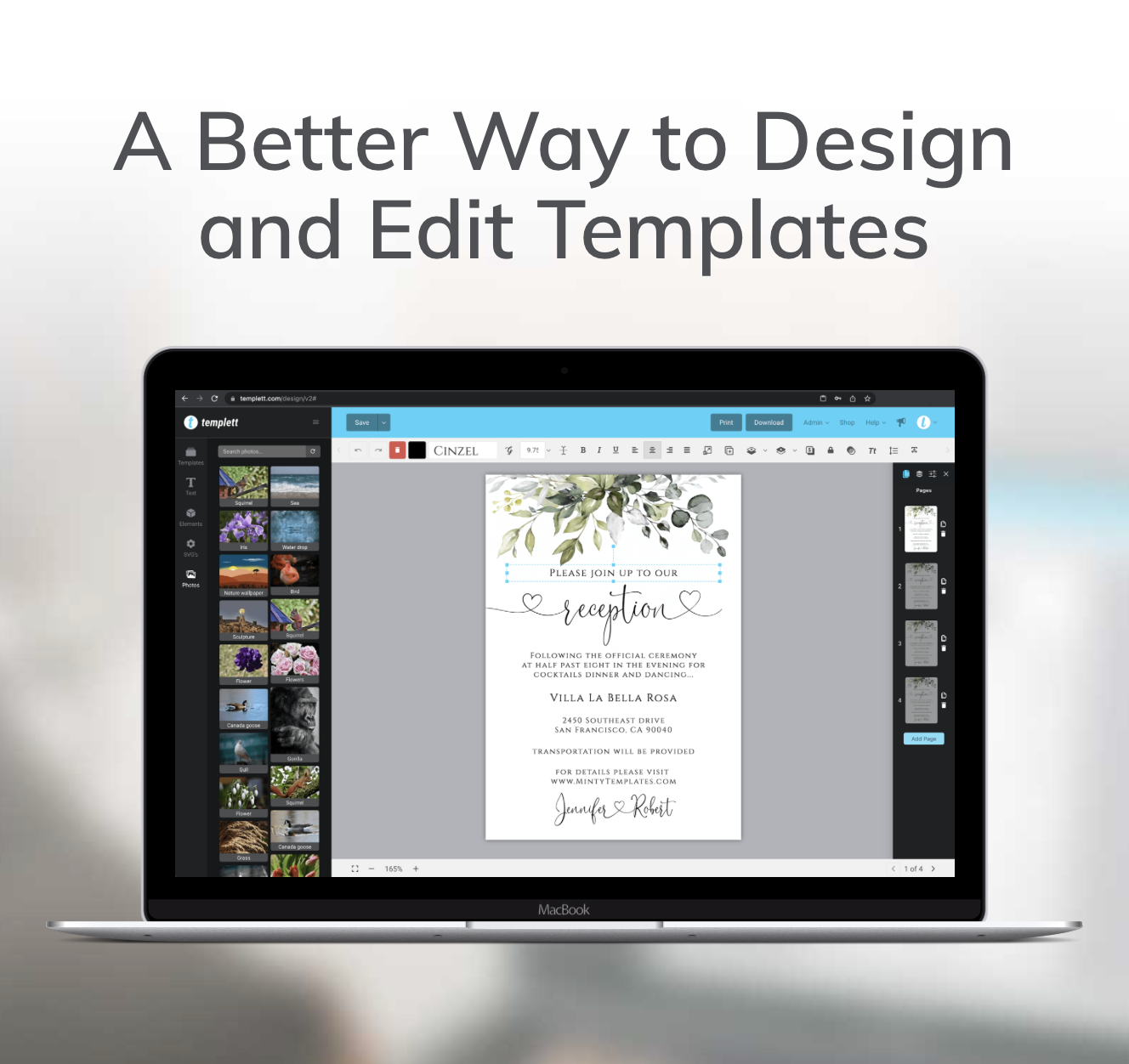
That’s one of the advantages of working in Templett. You can start with a ready-made template and spend your time developing the creative direction instead of feeling like you need advanced graphic design skills before you can create something worth selling.
Once you understand the process, it becomes repeatable across niches and occasions.
Halloween becomes Thanksgiving. Thanksgiving becomes Christmas. A birthday becomes a baby shower. A bridal shower becomes a dinner party.
The occasion changes, but many of the same design principles still apply.
Before You List Your Halloween Template
Once your design looks finished, give it one final review.
Start with readability. Can someone immediately tell what the event is? Are the date, time, location, and important details easy to find?
Then look at visual cohesion. Do the fonts, colors, illustrations, and decorative details feel like they belong to the same aesthetic?
Finally, zoom out and look at the design as a whole.
Does one element clearly grab your attention first? Is there enough breathing room? Does anything feel unnecessarily crowded? Are you adding decorations because they improve the design—or simply because there’s an empty space?
Small adjustments to spacing, scale, hierarchy, and alignment can often make the difference between a template that feels unfinished and one that feels polished and sell-ready.
Halloween Doesn’t Have to Look One Way
The biggest takeaway from these Halloween template design ideas isn’t that spooky designs are out.
They’re simply one option.
Cute, elegant, vintage, minimalist, moody, and kid-friendly styles give you more creative directions to explore—and more opportunities to create products for shoppers with different tastes.
Start with one template. Pick one aesthetic. Make a few intentional changes. Get it sell-ready.
Then take the same starting point and try something completely different.
You don’t need to become a graphic designer first. With Templett, you can start with a strong foundation, make simple tweaks, and build a repeatable process for turning ideas into polished templates you’re ready to list.