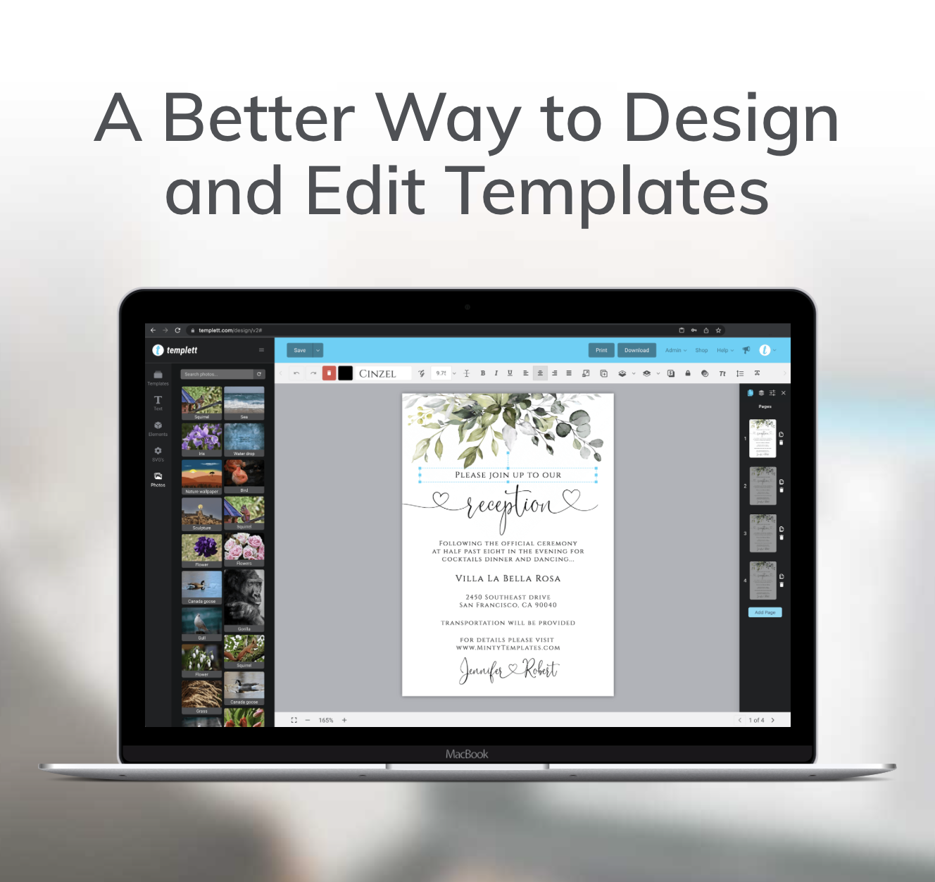
Ever finish a Christmas invitation and feel like something just doesn’t look right? The colors are festive, the illustrations are cute, and the fonts seem perfect, but somehow the whole design feels overwhelming. If you’ve been wondering why your holiday invitations look too busy, the answer often comes down to a few simple design decisions.
The good news is that you usually don’t need to start over.
Small adjustments to spacing, typography, color, and layout can make a huge difference.
Let’s look at the most common mistakes and how to fix them.

1. You’re Using Too Many Decorative Elements
Holiday designs are especially tempting to decorate.
There are Christmas trees, ornaments, snowflakes, ribbons, stars, candy canes, and countless other festive illustrations.
But adding too many elements can make your invitation feel crowded.
When everything is competing for attention, it’s harder for customers to focus on the important details.
How to fix it:
Choose one main decorative element and use smaller accents to support it.
For example, if your invitation features a large Christmas bow, you might only need a few small stars around the text.
You don’t have to include every holiday illustration to make the design feel festive.
Sometimes, one well-placed element makes a stronger impression than five competing decorations.
2. Every Text Element Is Trying to Stand Out
One of the biggest reasons holiday invitations look cluttered is poor text hierarchy.
Imagine an invitation where the headline, date, location, and RSVP details are all the same size.
It’s difficult to know where to look first.
A strong invitation should guide the reader naturally through the information.
How to fix it:
Create a clear visual hierarchy.
For example:
- Largest text: “Christmas Party”
- Medium text: Host’s name or event date
- Smaller text: Time, location, and RSVP details
This helps customers understand the invitation at a glance.
Remember, a design can look beautiful and still be difficult to read.
Both appearance and clarity matter.

3. You’re Mixing Too Many Fonts
Holiday invitations often use decorative fonts to create a festive mood.
But combining several script, serif, and display fonts can make a design feel inconsistent.
Instead of looking creative, it can look unfinished.
How to fix it:
Try limiting your design to two font families.
For example, use a decorative script for the main headline and a clean serif or sans-serif for the event details.
This creates contrast without sacrificing readability.
You can also use different font sizes and weights to create variety without introducing more fonts.
The goal is to make the design feel intentional.
4. Your Color Palette Is Doing Too Much
Red, green, gold, silver, blue, and white are all popular holiday colors.
But using them all in the same invitation can create visual confusion.
Too many competing colors can also make important information harder to read.
How to fix it:
Start with a limited color palette.
For example:
- Dark green
- Cream
- Soft gold
Or:
- Burgundy
- Blush pink
- Warm white
Choose one main color, one supporting color, and one accent.
This gives your invitation a cohesive look while still allowing it to feel festive.

5. There’s Not Enough Empty Space
One of the most overlooked design elements is empty space.
When text and illustrations are packed too closely together, the invitation can feel overwhelming.
And while it might seem like every empty area needs to be filled, that’s not the case.
Empty space gives your design room to breathe.
How to fix it:
Try increasing the spacing between text sections.
Move decorative elements away from important information.
Give the headline more room.
You may be surprised by how much cleaner the design looks without adding anything new.
6. Your Background Is Competing With the Text
Patterned backgrounds can make holiday invitations feel playful and festive.
But when the background is too detailed, it can distract from the information.
For example, placing small white text over a busy Christmas illustration can make the invitation difficult to read.
How to fix it:
Choose a simpler background or reduce the number of decorative details behind the text.
You can also place text inside a solid-colored area to improve contrast.
Make sure the invitation remains readable when viewed as a small Etsy listing image.
If shoppers can’t understand the design at a glance, they may scroll past it.
7. You’re Designing Without Thinking About Personalization
This is an especially important mistake for editable templates.
A design might look perfectly balanced with your sample text, but what happens when a customer replaces a short name with a longer one?
Or changes a two-line address into four lines?
Suddenly, the layout can feel crowded.
How to fix it:
Leave enough space for customers to update the important details.
Test your template with different name lengths, dates, and locations.
Make sure the text remains readable and doesn’t overlap decorative elements.
In Templett, you can also choose which elements customers are allowed to edit.
This helps you create a template that’s customizable while maintaining the overall design.
How to Fix Busy Holiday Invitations in Templett
If you’ve already created a holiday invitation that feels cluttered, you don’t need to throw it away.
Instead, try this quick design refresh:
- Simplify the artwork. Remove unnecessary decorative elements.
- Improve the text hierarchy. Make the event title the main focal point.
- Limit the fonts. Choose one decorative font and one easy-to-read font.
- Refine the colors. Stick to a cohesive palette.
- Adjust the spacing. Give each section enough room.
- Test personalization. Make sure longer customer details still fit comfortably.
These small changes can turn an overwhelming design into something much more polished.
And because you’re working from an existing template, the process can be surprisingly quick.
Why Cleaner Designs Can Help Your Etsy Listings
Your Etsy listing images are often the first introduction shoppers have to your products.
If your invitation looks cluttered or difficult to read, customers may struggle to understand what they’re buying.
A clean, well-organized design makes it easier to see the important details and appreciate the overall style.
It can also help customers imagine how the invitation will look with their own information.
That doesn’t mean every design needs to be minimalist.
You can still create playful, colorful, or highly decorative invitations.
The key is making sure every element has a purpose.
Final Thoughts
If you’ve been wondering why your holiday invitations don’t look as polished as you’d like, the solution might be simpler than you think.
You don’t need more illustrations, more fonts, or more colors.
Often, you need fewer elements and better organization.
Focus on clear typography, balanced spacing, and cohesive design choices.
Then, use Templett to customize your template and make sure it’s easy for customers to personalize.
Ready to give your holiday designs a refresh? Start creating with Templett and turn your ideas into polished, sell-ready invitations.