
Learn and be inspired!
Your destination for creative inspiration, design tips, and insights to help you create stunning templates with ease!
Small Seasonal Opportunities for Etsy Sellers
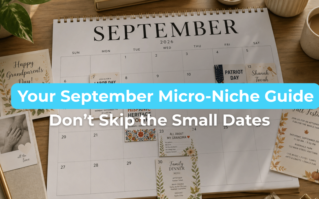
Small seasonal opportunities for Etsy sellers can be easy to overlook, especially when bigger moments like Halloween and Christmas are already on your mind. But September brings several smaller occasions that can inspire focused, timely products without requiring an entire seasonal collection. That’s where micro-niches become useful. Instead of creating something broad like a “September printable” or a generic holiday design, start with the date, then narrow it down to a specific person, gathering, or moment. A smaller audience can actually give you a clearer design direction. For 2026, Labor Day falls on September 7, Patriot Day is September 11, National Grandparents Day is September 13, and National Hispanic Heritage Month begins September 15. Here are a few September moments worth exploring—and how to turn them into more specific product ideas. Labor Day — September 7 Labor Day may not immediately feel like a template-heavy occasion, but the gatherings around it can create...

Summer 2026 Template Trends
Every year brings new trends in what buyers are searching for, and Summer 2026 Template Trends are...

The Etsy Template Saturation Myth
The Etsy Template Saturation Myth is one of the biggest reasons many sellers hesitate to start or...

Best Digital Products to Sell on Etsy
If you’ve been researching the Best Digital Products to Sell on Etsy in 2026, one thing is...

How Printables Generate Passive Income
Many people want a side hustle that does not require inventory, shipping, or constant client work....
Beginner Guide To Selling Printables
Selling digital products can feel overwhelming at first, especially if you do not consider...

Template Color Palette Tips
One of the fastest ways to make a template look unprofessional has nothing to do with fonts,...

How to Choose Where to Sell Digital Products
If you’re trying to figure out how to choose where to sell digital products as a beginner, you’re...

Mother’s Day Templates That Sell
If you’re creating Mother’s Day templates that sell, it starts with understanding what makes this...

How to Make Printables to Sell Immediately (Even as a Beginner)
If you’re trying to figure out how to make printables to sell immediately, the biggest...

Dark Romance Wedding Templates: Trending in 2026
In 2026, one wedding aesthetic is standing out across Etsy: Dark romance wedding templates. This...

Full-Time Template Seller Habits
Most template sellers don’t struggle because they lack ideas. They struggle because they don’t...
Teacher Appreciation Week Cards Buyers Love
Teacher appreciation week cards work best when they feel thoughtful and easy to use. Buyers aren’t...