One of the fastest ways to make a template look unprofessional has nothing to do with fonts, graphics, or layout. It’s the color palette. And most new template sellers don’t even realize they’re making this mistake. A design can have beautiful illustrations, trendy typography, and a great concept, but if the colors feel random or disconnected, the entire template starts to feel slightly off. Buyers may not know exactly why they’re scrolling past your listing, but they can instantly tell when a design doesn’t feel polished. The good news? This is also one of the easiest design problems to fix. Once you understand a few simple template color palette tips, your designs immediately start looking cleaner, more cohesive, and more sell-ready without needing advanced design skills.
Let’s break down the biggest mistake new sellers make and how to avoid it.
The Biggest Color Palette Mistake? Using Too Many Colors
This happens constantly with beginner template designs.
A seller might pull in a trendy dusty blue, soft blush tones, metallic gold accents, earthy sage green, warm beige neutrals, and dark text from completely different sources.
Individually, none of these colors are bad.
Together, though, the design starts competing with itself.
Instead of feeling intentional and polished, the template begins to look visually crowded. There’s no clear direction, and buyers end up feeling overwhelmed without even realizing it.
This is especially common in:
- wedding invitations
- baby shower templates
- birthday invitation suites
- bridal shower games
- welcome signs
- editable party templates
The goal isn’t to use more color.
The goal is to create cohesion.
And cohesion is what makes buyers trust a design.

Why Cohesive Color Palette Matter So Much
When buyers shop for editable templates, they make decisions fast.
They’re not carefully analyzing your typography choices like a designer would. Most people are reacting emotionally within seconds.
If the colors feel balanced and consistent, the design immediately feels:
- modern
- professional
- premium
- easier to customize
- more trustworthy
That’s a huge part of perceived value.
A simple invitation with a strong color palette often performs better than an overdesigned template filled with too many competing colors.
This is one of the most important template color palette tips new sellers need to understand: buyers want designs that feel clean, balanced, and easy to scan.
The easier a design feels to look at, the more polished and professional it appears.
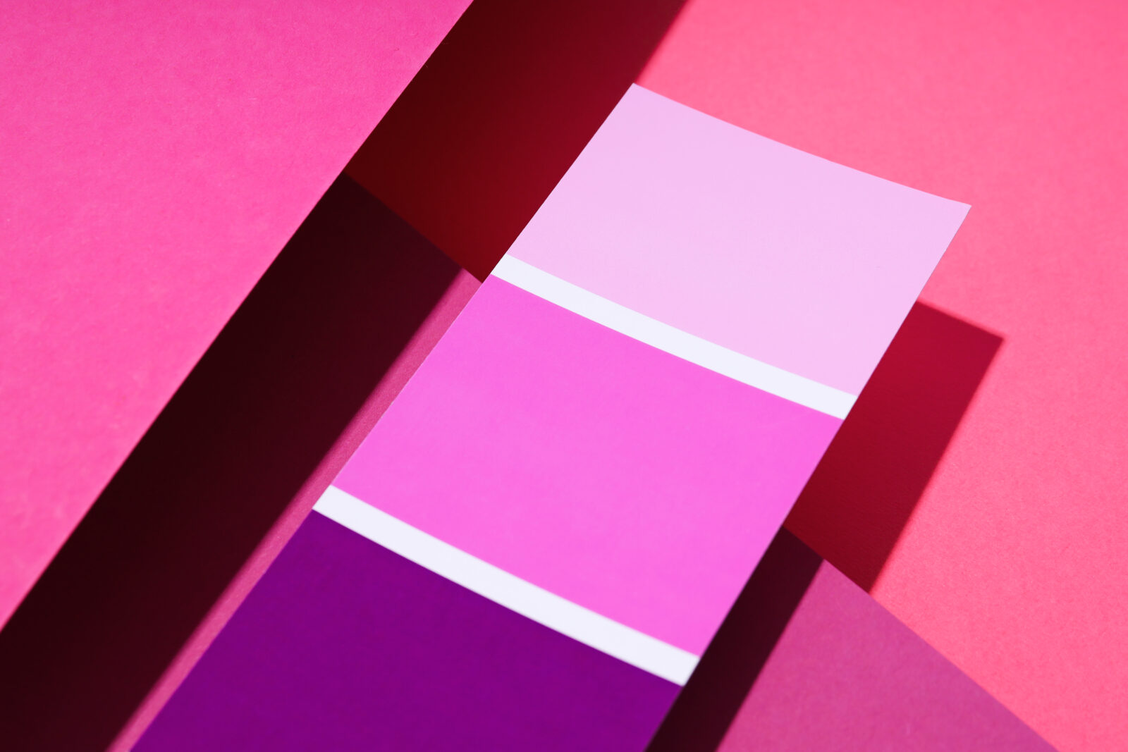
Template Color Palette Tips: Use the “3 Color Rule”
If you constantly struggle with colors, here’s one of the easiest fixes:
Start with just 3 main colors.
A strong palette usually includes:
- a primary color that sets the tone
- a secondary shade that supports the layout
- an accent color that adds contrast and focus
For example:
- Cream + dusty blue + muted gold
- Sage green + ivory + charcoal
- Terracotta + beige + soft brown
- Blush pink + white + dark taupe
Immediately, your template starts feeling more organized.
This also makes customization easier for buyers because the design already feels structured and cohesive.
You can always introduce additional shades later, but starting with a smaller palette prevents designs from becoming visually messy.
Why Trending Colors Sometimes Hurt Your Templates
A lot of sellers chase trends without thinking about balance, and this is one of the biggest mistakes new sellers make when applying template color palette tips to their designs.
Yes, trendy colors matter.
But trendy colors alone don’t create strong design.
You’ve probably seen templates that try to include every popular wedding color at once:
- sage
- champagne
- blush
- rust
- dusty blue
- eucalyptus green
The result usually feels crowded instead of elevated.
One of the most important template color palette tips to remember is that strong templates use trends selectively instead of trying to include every popular color in a single design.
The best sellers often combine:
- a trend-forward statement color
- a neutral shade that softens the palette
- a darker grounding tone for contrast
That combination creates balance without overwhelming the design.
These kinds of template color palette tips matter even more for editable invitation templates because buyers want something that feels stylish while still being easy to personalize.
Your Text Color Matters More Than You Think
Another common mistake?
Using soft trendy colors for body text.
Beige text on cream backgrounds might look aesthetic at first glance, but readability always matters more.
If buyers struggle to quickly read:
- names
- dates
- event details
- instructions
…the design instantly feels less professional.
This is where many new sellers accidentally prioritize aesthetics over usability.
One of the best template color palette tips is simple: always prioritize readability first.
Good design isn’t about making everything decorative.
It’s about presenting information clearly while still feeling beautiful and cohesive.
That balance is what creates polished, high-converting templates.
Neutral Colors Are Your Best Friend
A lot of beginners avoid neutrals because they think neutral means boring.
In reality, neutrals are often what make colorful designs look sophisticated.
Without them, templates can start feeling loud very quickly.
Some of the best neutral colors for invitation templates include:
- warm ivory
- soft cream
- muted taupe
- dusty gray
- charcoal
- soft sand
- warm white
These shades help:
- calm the design
- improve readability
- create balance
- make accent colors stand out more naturally
Professional-looking templates almost always use restraint.
That’s the difference.
How to Know if Your Color Palette Is Working
Here’s a simple test.
Zoom out from your design and look at it from a distance.
Ask yourself:
- Does the layout feel balanced?
- Is there one clear focal point?
- Do the colors feel connected?
- Is anything visually distracting?
- Can you instantly read the important information?
If your eyes don’t know where to look first, the palette may be competing too much.
A strong color palette supports the content instead of overpowering it.
That’s what makes templates feel clean and intentional.
Simple Color Palettes Often Sell Better
This surprises a lot of new sellers.
Many assume buyers want extra graphics and decorative elements, larger color palettes, layered textures and visual effects, or heavily styled layouts.
But buyers usually respond better to designs that feel:
- clean
- readable
- modern
- cohesive
- customizable
Especially in life-event categories like:
- weddings
- baby showers
- birthdays
- bridal showers
- graduation parties
People want templates that feel stylish without feeling overwhelming.
That’s why simpler color palettes often perform better in search results and listing previews.
They’re easier to scan.
Easier to personalize.
And easier for buyers to imagine using for their own event.
Final Thoughts on Color Palette Tips for Template Sellers
If your templates feel slightly off, your color palette may be the reason.
The good news is you do not need to become a professional designer to fix this.
Most of the time, stronger templates come from:
- using a more focused color palette
- creating stronger contrast between elements
- keeping styles visually consistent
- improving layout hierarchy
- making important information easier to read
Small adjustments create a huge difference in how polished your templates feel.
And once you start applying these template color palette tips, you’ll notice something interesting:
Designing actually becomes faster.
You spend less time second-guessing color combinations, less time over-decorating layouts, and less time trying to force unrelated styles together.
Instead, you create templates that feel intentional, cohesive, and genuinely sell-ready.